

New Season, New Logo…
A season entrenched in tradition, Fall is the optimal time to reflect and embrace change. Just as the leaves change their colors and amble along, the Fall season ushers in profound transformation. While we may feel morose to see the joys of Summer come to an end, the promise of Fall reminds us that while change can be daunting it can also be remarkably beautiful.
For farmers, Autumn marks that sacred window of time needed to harvest crops in preparation for the coming Winter months. Finding ultimate balance becomes the key to any successful harvest season and there is no clearer representation of this than the Autumnal Equinox. Both the day and night last precisely 12 hours and, in turn, remind us of the importance of seeking out balance in our own respective lives. Through this transition, we encounter a hallowed knowledge passed down throughout the ages, and it is reliant on us to put this newfound perspective to work. Change leads us to balance.
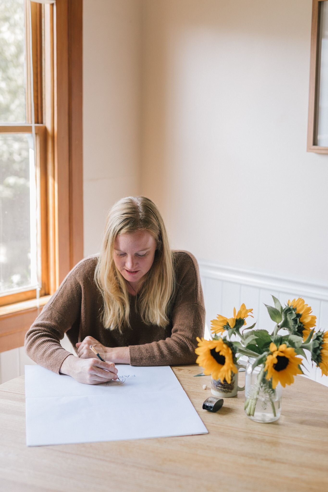
Here at Farm Cart Organics, we are in the midst of our very own metamorphosis. While we unveiled our new (and vastly improved) software at the beginning of September, we have exciting news as we enter the month of October...we have a brand NEW logo! Created by one of Santa Barbara’s premier graphic designers, Lauren Sexton of Lauren Sexton Designs. A Cal Poly SLO alum, Lauren is also the current Creative Director at Topa Topa Brewing Company and has worked with clients ranging from Patagonia to True Ames Fins (Ventura). She does it all!
However, at the very beginning of COVID-19, Lauren came to work for Farm Cart Organics as a farm box packer. Lauren remembers her time spent working on the packing line as “such a bright spot in an otherwise tough season” because she was able to do what she could “to help our community receive access to their most basic need for healthy food.” Adding, “our crew was the most positive, hilarious, and kind group of folks you could ask for. It felt so stinkin’ good to be part of a team when isolation was the norm.”
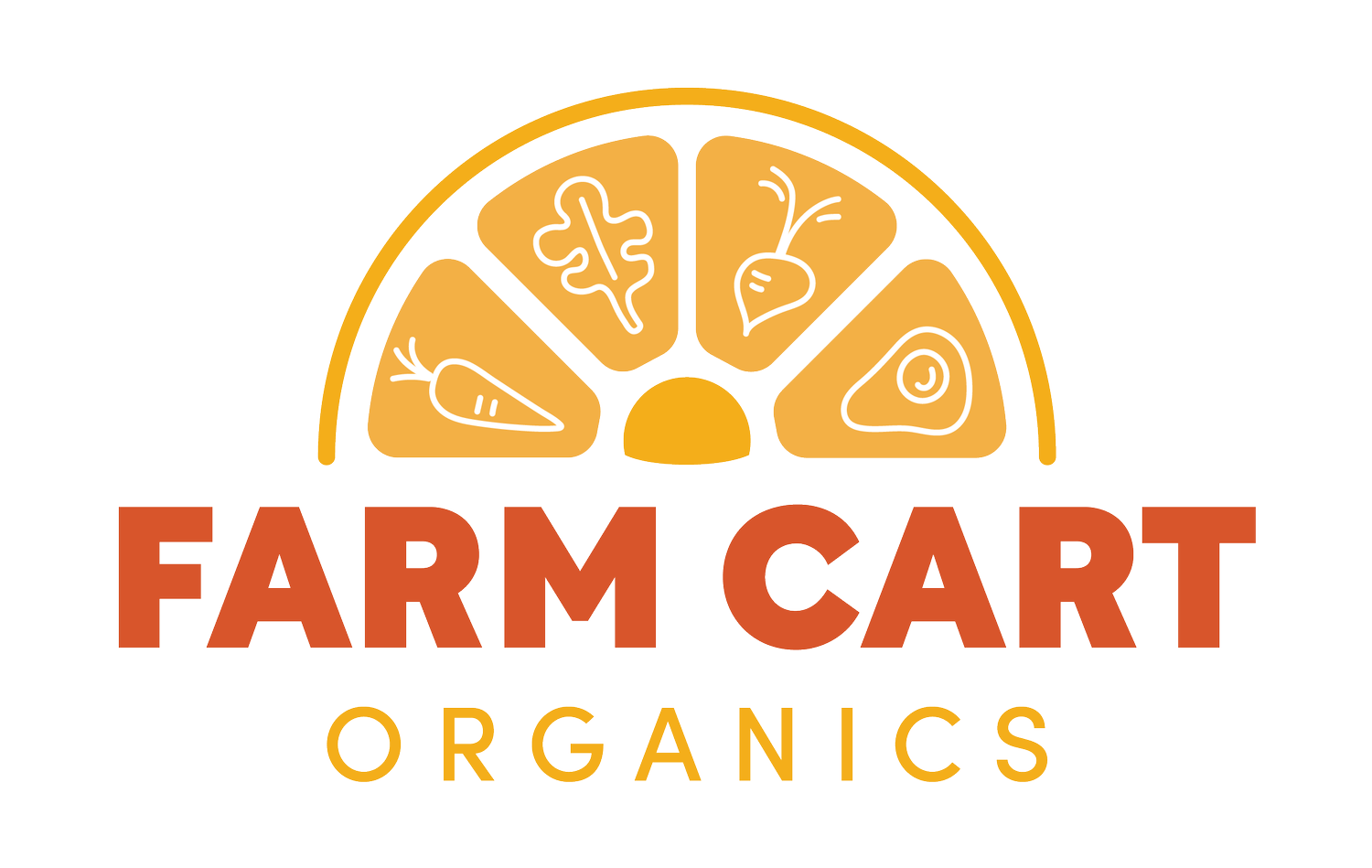
So, naturally, co-founders Katie and Jason Lesh approached Lauren about reimagining Farm Cart Organics’ brand — and here we are today! Sexton recalls, “they told me they were looking for something ‘farmy, fun, surfy, light, and makes you feel good’ [and] I wanted to give them all of those things aesthetically, to capture that positive feeling I became so acquainted with during my time packing boxes with the team, while also telling the bigger-picture Farm Cart Organics story. One thing that continually amazed me about FCO was just how many people were being fed through this grassroots operation. After going through a number of concepts and revisions we landed on the final logo, featuring the semi-circle icon which is all at once a sunrise, a slice of citrus, and a wheel with the veggies representing the day-to-day work and most fundamental nutrients that make the wheel turn and feed the community.” Everyone here at Farm Cart Organics couldn’t possibly be more pleased with the final product, as it perfectly reflects all that we do and strive to be. Thanks for the great work, Lauren!
As blooming flowers are replaced by crunchy leaves and crisp morning air, we are grateful for the lessons Fall has to teach us. Thanks for supporting local! Stay tuned for Autumn’s bountiful harvest.